Hub documentation
Model Card components
Model Card components
Model Card Components are special elements that you can inject directly into your Model Card markdown to display powerful custom components in your model page. These components are authored by us, feel free to share ideas about new Model Card component in this discussion.
The Gallery component
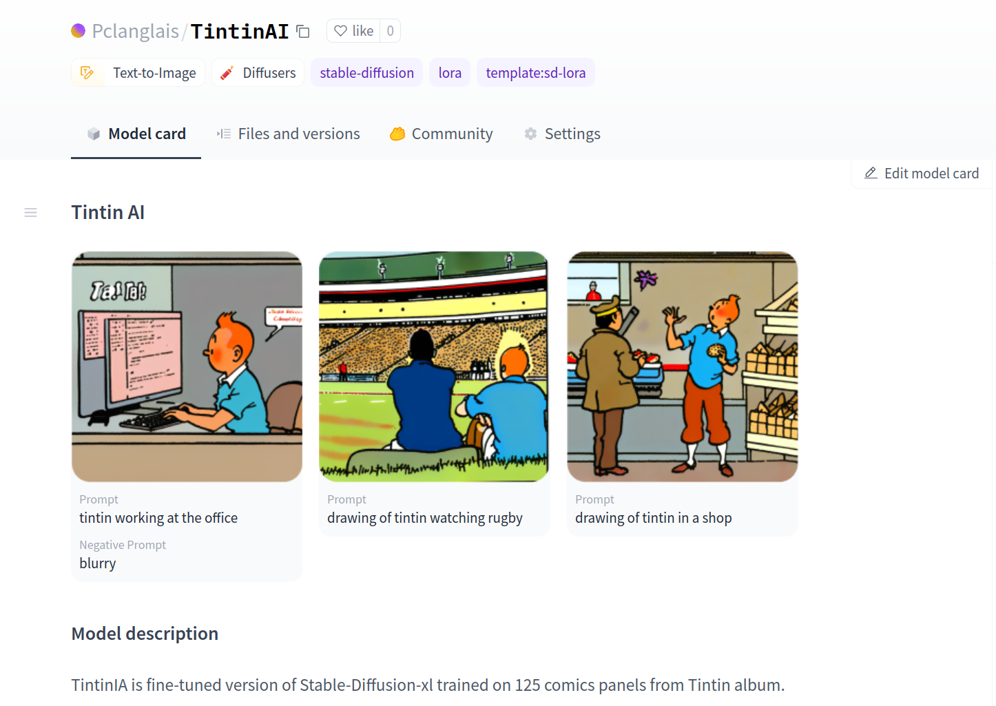
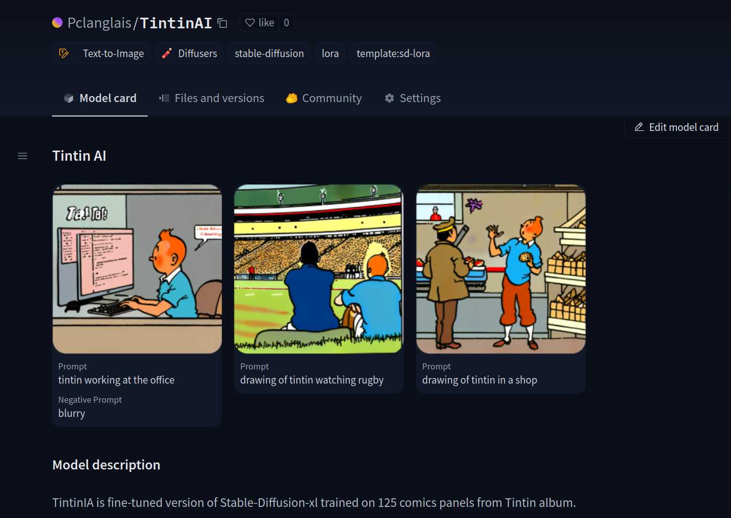
The <Gallery /> component can be used in your model card to showcase your generated images and videos.
How to use it?
- Update your Model Card widget metadata to add the media you want to showcase.
widget:
  - text: a girl wandering through the forest
    output:
      url: images/6CD03C101B7F6545EB60E9F48D60B8B3C2D31D42D20F8B7B9B149DD0C646C0C2.jpeg
  - text: a tiny witch child
    output:
      url: images/7B482E1FDB39DA5A102B9CD041F4A2902A8395B3835105C736C5AD9C1D905157.jpeg
  - text: an artist leaning over to draw something
    output:
url: images/7CCEA11F1B74C8D8992C47C1C5DEA9BD6F75940B380E9E6EC7D01D85863AF718.jpeg- Add the
<Gallery />component to your card. The widget metadata will be used by the<Gallery />component to display the media with each associated prompt.
<Gallery />

## Model description

A very classic hand drawn cartoon style.
See result here.
< > Update on GitHubHint: Support of Card Components through the GUI editor coming soon…